Showing posts with label Process. Show all posts

Tuesday, March 18, 2014

Process: Personal Work


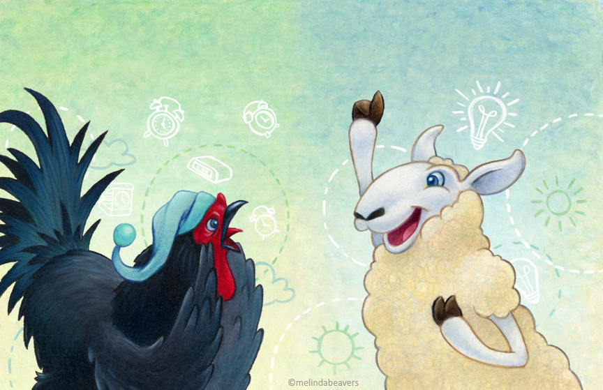
I recently finished this new piece as my assignment for the Austin SCBWI Conference. I signed up for the conference a bit too late to have completed the piece BEFORE the event, but art director Laurent Linn was kind enough to invite all attendees to submit a revised or new piece, via email, a few weeks after.

I've also been thinking about experimenting with my style, and this piece gave me the perfect opportunity to try some new ideas. Those of you that know, know I LOVE colored pencil. One of the biggest downsides to working with CP is the time it requires, especially in my chosen approach of burnishing (full paper coverage). I decided to try working at a smaller scale and enlarging my pencil work, to bring out the hidden textures in my usually ultra-smooth looking work.

Concept & character sketches. I didn't have a lot of time to really develop them as much as I would have liked, and I kept second-guessing myself… I eventually decided I just had to go with it and see what happened.
Background, completed separately. It's about 30% of the final size (70% reduced scale). The spot I pulled out isn't even 100%, but it gives you an better idea of the hidden texture that comes out with enlarging.
Characters are about 50% reduced scale. I'm naturally drawn to line work, but I hoping to incorporate the line work in future pieces in a fully digital way, as seen below.
I did single line drawings are random sizes and scaled them as needed to find a composition that worked for the story/piece. These are done in black colored pencil, which adds to the texture/grittiness of the line (although I'd like to try some regular graphite lines, just to see the difference). I them remove the white paper and digitally edit the line colors as needed (mainly via blending layers in photoshop).


So,what do you all think? I'm enjoying this direction, hope you are too!

Thursday, February 06, 2014

Update: The SCBWI-NM Enchantment Show

Our local SCBWI Illustrator's group is doing a show this year, called Enchantment. It's a joint show with writers—several illustrators have completed and submitted pieces (loosely based on the theme of enchantment), which have been randomly assigned to local writers, who will write a one page story based on the image.

In May, all artwork and single page written works will be framed and hung together at one of our local libraries. I've decided to post my piece and my process so far. It's mostly done… but I'm still tinkering with it.

Initial concept, thumbnail sketch
Polly (polar bear) and Sunny (sun bear) meet in the middle of the ocean.

Monday, February 03, 2014

Process: Album Cover

Just finished up a project I started last year—an album cover for a local musical group. This was really fun and completely unlike my usual projects. It's nice to mix things up a bit from time to time.

Digital processes

Tuesday, May 22, 2012

AlphaBooks A - Aravis Tarkheena


Monday marked the start of AlphaBooks, the new weekly challenge by Ben Towle, Andrew Neal & Rich Barrett.

"AlphaBooks is the name of the game. We will be drawing ficitonal characters from books every week - one for each letter of the alphabet. On the first day (Monday, May 21), everyone will draw characters whose names start with the letter “A.”  The following monday, we’ll draw characters whose names start with the letter “B.” And so on!"

Continuing in the flavor of my AlphaBeast series of detailed black & white sketches with an element of story and/or background, I originally thought I would choose all (or mostly) animal characters from books… because, well… that's my thing. And although Aslan was on my list of ideas, I had accidentally looked at the AlphaBooks page and saw he had already been claimed… more the once. So I went for a lesser known, but still a strong character from the Chronicles of Narnia, Aravis from The Horse and His Boy. An exempt from Wiki:

Aravis is a young Tarkheena, a female member of the ruling nobility of Calormen. With her horse, Hwin, who is revealed to be a talking beast from the land of Narnia, she flees from her home, in her brother's armor, in order to escape an arranged marriage. Aravis is a strong character, whose confidence, bravery and loyalty are offset by arrogance and self-centeredness. She is also an amazing storyteller.
It's been years since I read the book, but it's one of my Narnian favorites. I knew I wanted to do more than just a 'portrait', but not necessarily a 'scene' from the book. After looking up visual references (below) to get the ideas for her overall dress going, I just started doodling and eventually found a pose/situation that suggested a more than a mere portrait would.

Rough Sketches, looking for ideas… "hit it" over on the right.


Original unedited scan, col-erase pencil
References include various web & movies!
Any excuse to watch a movie, I tell you. ;)


So, what do you think of my Aravis? Does she look like her description?

Monday, March 05, 2012

Introducing QiWi

What is a QiWi you may ask? Well, he's not a fruit… or rather, he insists that he is not (I beg to differ, on occasion)

QiWi is a type of chimaera, a blend of several animals that make one magical critter (like griffins, mermaids and enfields). His particular type is called a Tirsu (Tier-soo).

*He’s also my new mascot & studio helper. He doesn’t have an artistic bone in his body, but with that handy gripping tail of his, he’s always ready to hand me what I need while I work. QiWi, where’s that cup of coffee I asked for?!

QiWi does think himself rather handsome, so he wanted me to share a bit of the process of how he came to be. It all started seven years ago…

Pt 1When I initially started designing a brand for myself there were a few important elements I wanted to include: I wanted it to be something unreal (I wanted to make it up) and having elements that were drawn and designed (after all, I do illustration and design). I sketched a horse-like critter in my notebook, scanned him, created vector artwork from the sketch, and blended the two. I kept things black & white because I wanted to highlight the color in my artwork… plus I was tired of seeing white backgrounds everywhere. Whatever, I’m over it - I need color now.

Pt 2I decided I needed an update, I didn’t want to start from scratch. So I took the old icon and started tinkering. I’d never drawn that original critter any other way, so I started playing with showing him in different positions, and even facial expressions.

Pt 3Then I started getting down to the details, okay he’s still very horse-like (what can I say, I like horses and I’m really good at drawing them). But he’s also got a very long neck like a giraffe and a curved back like a dragon or a dog. I’m not sure about the mouth feature yet - but he does have a bit of a cow nose. I spent quite some time trying to work out his feet - it was one of the features I wasn't particularly not happy with from the initial concept. I didn’t want him to have hooves, and I didn’t want them to be just paws - I eventually landed somewhere in between creating a kind of toed hoof (which is somewhat ironic given that a hoof is a toe, that’s right, for those of you that didn’t know, horses have four single toes). I was going to have a tufted tail (as you can see from the rough sketches), but I went back to the flowy horse-tail when I decided he would have movement control of each hail - like a million extra arms that work together to grip like hands.

Pt 4Now that I had a good sense of his overall structure and details, I just started sketching poses again and I landed on a unique one I thought would work well to compliment my new logotype (hand lettered - I’ll share that in another post soon) and my branding overall. It’s a unique position (horses and giraffes don’t sit, but dogs and dragons do). After the initial rough idea, I added the elements that help him identify with me (as my mascot & helper - he’s holding some of my tools). I also liked the tilt of his head, it’s almost inquisitive.

Pt 5Next… color. Always tough when you’re making things up as you go. I never had to think about this in the initial design, but luckily I’d already decided on a color palette for my new website, so I had something to start with. I did several of color studies, but ended up sharing these four with some of my trusted advisors (i.e. my crit group) and the consensus was V4. I had to agree, it’s unique, has an exotic feel to it, and it’s the least real-horse-like of the group. And there are aspects of this coloring that are reminiscent of a horse character I designed back in the 5th grade for a class picture book project. I kinda of liked the nostalgia of it.

Pt 6Then, I admit, I felt a bit rushed. I was anxious to get something done that I could share and get up on my new website & blog. Working digitally allows for extra editablility in the developmental process - so I decided to go vector first. It allowed me to work out a couple problem areas without redrawing 50 million times, plus is gave me wild freedoms in developing design elements for the website and branding I need him for. It’s a good place to start. I will use this finalized vector art to help create a finished version in graphite (which will be colored digitally) and a colored pencil version (which everyone is going to like the best - they always do).

Pt 7And so, here we have it… final vector line art and color. With a couple silhouettes for fun. I like silos, but since he’s a critter I made up and people aren’t familiar with him yet, it’s a bit confusing so I probably won’t be using them any time soon.

I just love making things up, and it’s been a lot of fun figuring out QiWi’s look. I can’t wait to share more versions of him and more poses… and perhaps, one day - a QiWi adventure!

Friday, December 23, 2011

Happy Holidays!


-----------------------------------------
And a little behind-the-scenes process work:
First, after trying to start three times before, I finally decided to center the image on the road runner. I'd had a lot of fun drawing him for my card two years ago and I'd already had a special rubber stamp made of him, so I would get to use it again:

These two images give an idea of how I build illustrations - I start with rough sketches. If I get something I like, I scan and piece together an overall layout template to use to either transfer or as a light-table guide. In this case I had to transfer the old-fashion graphite way, because the paper I did the final drawing on was ultra-thick (I mean NO LIGHT was getting thru that sucker).
I also had to plan for the paper-punched layered star (fixed in place with a gold brad), which looks like a moon in this template.
At this point, I was still going for 3 road runners. I eventually decided against the 3rd because I didn't like the way his beak stuck into the back of the front road runners head and two seemed enough to communicate the message of loved ones and/or friends. BTW, the mountain range in the background is the actual Sandia Mountain Range, as viewed overlooking Albuquerque.


My sketchbook page of swatches and notes… trying to decide what colors to use, materials, trying out stamp colors, etc.


This is the the final illustration with no digital adjustments, straight-up scan.

Thursday, June 30, 2011

Illustration Friday: MIDSUMMER NIGHT


Once again, I've run out of time… but I'm still trying to keep my promises to myself and participate & post for Illustration Friday regularly. So, here's a work-in-progress for the Midsummer Night theme: a mock-up book cover sketch. I plan to add a whole lot more (possibly animals in the tress, fairies?, etc.) and make it a real melding of illustration in the background with designy elements in vector overlapping/transparent on top. I also couldn't pass up a chance to do some hand lettering. Love it.

Basically I just started doodling and my mind wandered and eventually landed on this idea for a book cover. All while on a plane, being watched by fellow travelers.

Tuesday, June 21, 2011

Illustration Friday: LAUNCH


This week has turned into something crazier than I can manage. I was hoping to do a finished drawing of this, but I am just not going to have the time this week… so I decided to just post this concept sketch and be done with it - accept and move on. Fun stuff happening, so I can't be too upset about it. :)

Thursday, June 09, 2011

New Idea: Drawing Morning Pages (Doodle Edition)

Even as a professional illustrator, I sometimes hit a wall of not being able to draw… to just draw.

With no specific purpose, just for fun.

It's been a nearly constantly struggle for YEARS to get myself to do so - probably because it's "safer" not to. But I really want to be drawing more, because I believe just making marks on paper is a great way to general ideas and stimulate creativity in general.

Like many creative people on an artistic journey, I've read the Artist's Way (at least a good part of it), which encourages one to file three notebook pages with stream-of-consciousness writing every morning, as a way to remove the "junk" from floating around in your mind and clear your head for the day before you (at least that's what I got from it).

So I decided to try it for my drawing habits… just fill two pages of my moleskin sketchbook each morning, with line, shading, dots, whatever - just to put something on paper and force some stuff out of my head. I've only been going for five days so far, but almost immediately the lines began turning into things -I've started making purposeless drawings… just for fun, just because I can!

I'm so used to having a specific PURPOSE to draw, that just making lines and seeing where they take me is a wonderful & surprising journey. I'm really enjoying it so far.

*The only drawback (unintended pun, d'oh!) is that I'm getting into and spending too much time on them. But I'm not necessarily against spending the time. At least not right now. At some point I might challenge myself to do faster/time limited drawings, but right now I'm just happy to be drawing and I'm going to go with it.

Sunday, June 05, 2011

New Work: Sticker Sunday - "Cap & Gown"

For some it's still graduation season… so here is another grad themed sticker design I worked on recently. I can't say how many graduation themed stickers I've worked on in my career, suffice to say it's been a lot. After the 10th time for so, it starts to get hard to look at it fresh and not repeat yourself, so when I was asked for a cap & gown theme again, it knew it was going to be a challenge.

Color can also be tough, because many graduations are dependent on the school colors, so product design has to stay generic enough to work for eveyone, but not be SO generic it isn't fun & interesting.

But I was really happy with how this one turned out. The gowns are maybe a bit stiff, but I love how I got to play with the cap & tassel icons, and lay them out in such a way they mimic the actual tossing of the caps that usually comes at the end of the ceremonies.

Stickers like these are usually used as accents on graduation scrapbook pages and/or party invitations and the like, to add an exciting little bit of theme-specific flare.

Sunday, May 22, 2011

New Work: Sticker Sunday - "Class of 2010"

I apologize for missing Sticker Sunday last week - but I was a little busy. ;)
This week, I'm posting a graduation themed sticker sheet… even though it's from last year's graduation season.
As you can see in the sketch, it started out being a numbers game - a customizable design that would be timesless. But this typical approach to the graduation theme, it just looks boring. Somewhere in development the decision was made to make it specific to 2010, and I really like the results, even though it only got to sell for one season. I'm never actually seen one of these sheets in person, I wonder how the production materials turned out. Guess I'll never know, now. :(

Tuesday, March 29, 2011

Live Model Drawing Session

My local CPSA district chapter (219) had our monthly meeting this past Saturday and we had a special treat! The meeting theme was portraits and one of our members brought in a live model so we could all sit and draw together. It's been a long time since I've worked from a live model - I love my photo references, but it was fun. I really enjoyed the pure drawing time. I wish I had spent some time doing quick gestural sketches, but since we were focusing on portrait, and the model wasn't moving or trying different poses, it didn't really make sense to do them.

So, here's our lovely model, her name was Nafshiyah:


I started with a warm-up sketch in graphite:


And then I decided to try my colored pencils… which is a little tough given that colored pencil doesn't really erase - it's more of commitment:


This is a little test I threw together in photoshop - an overlay of my second drawing and my reference photo. Looks pretty good! I impressed myself!! But I can see I've made the eyes too large, plus low and to the right (set back on face) - which led to a displaced ear (also too low and set back), but it appears to be approximately the right size. Which is funny because one of the members walking through the session commented that she thought it might be too small. ;)

Sunday, March 20, 2011

New Work: Sticker Sunday - "Spring Rainbows"

Hey, tomorrow is Spring! In honor of this new season, and the end of a cold & dreary winter (not to mention exceptionally snowy in some parts of the US) I present one of the more fun sticker sheets I illustrated recently. As usual, the theme was given to me in title only, with no more to go on than that - it was basically left up to my own interpretation. I've always appreciated the clean graphic rainbow, but this theme allowed me to add a bit of twist with blooming flowers and growing leafy vines. It's just so brightly colorful and happy - especially with the butterflies to add a little life in the mix. It's always fun to play around with stylization and graphic simplification.

Sunday, March 13, 2011

New Work: Sticker Sunday - "Gardening"

And so, it is almost springtime! It's time to start thinking about garden plans, needs, and supplies. This is a sheet I worked on a couple years ago, and although I'm not much of a gardener, one I've always been quite fond of. I guess I like the idea of gardening, but I can never seem to get myself out the door to do any! I'm much more of a houseplant aficionado. Give me a Bonsai any day (and yes, I did a sticker sheet for that ;). Anyway, even though it's a theme made up of not-the-most-exciting icons, I guess I've always liked the color and flow of this sheet - it almost tells a complete story of someone about the head to the garden, what they've planned, and what they'll need. That's kind of rare in stickers.

Sunday, February 06, 2011

New Work: Sticker Sunday - "Hearts & Stars"

Happy February! I've never been a big fan of Valentine's Day, but I have done a LOT of heart and love themes stickers. This is one of the most recent, and most experimental/non-conformist of the bunch. I'm still not sure what material they are actually printed on (haven't seen a sample), but during work on this project, they were rumored to be going on chipboard (a rigid and thick material, compared to standard paper adhesive stickers). I was asked for a doodling style which recently became a popular theme itself, on stationery products at the time. As you can see, I initially included words and phrases in the design, but they were eventually removed because they were deemed illegible.

I started out with a very "pop" color theme (cyan, magenta, bright green, black & white), but I was asked to revise to include red. Eventually the green came out all together and magenta, red, and cyan became the final dominant color way. Personally, I really prefer my first submission - layout with text and color, but I still can't wait to see what the actual product looks like. :)

Sunday, September 26, 2010

New Work: Sticker Sunday - "School Years"

Last September Sticker Sunday and the last of my school themes for a bit… here are three other school year designs I did:

Once again these stickers were producted in layered mylar (a metallic), which you can see just a bit of in the Sophomore sample image - I don't have actual samples of Freshman and Junior. I don't actually have a sample of Sophomore either, but EK just happened to have a scanned image on their website.

These were actually pretty tough assignments - making "icons" to represent the subtly different years of high school / college - well that's pretty obscure. I'm really happy with how they turned out - and I hope there are some scrapbooking moms out there that are really enjoying them on they're kids' pages. :)

Sunday, September 19, 2010

New Work: Sticker Sunday - "School Senior"

Still in September, continuing along the school theme… here is an interesting sticker project I worked on a while back. It's a more "designy" illustration style and you can see I put a lot less detail in this sketch - it was more about concepts than beautiful rendering. This is one of the ones that changed the coloring after I had approval and the final art was delivered:The client gave the instructions for a fun graphic style with icons that included words. I also did "freshman", "sophomore", and "junior" - and each one had a dominant color theme. They didn't make many changes to those, but they obviously decided they didn't like the color way I'd chosen for this and changed it at some point. This is part of the production process and really doesn't bother me - they are still really fun stickers!

I had no idea what material they would be producting these stickers in when I completed the designs. Turns out they did layered mylar! Super fun and fancy! I happen to have some samples and snapped a few pics - they really don't do them justice, but you can get an idea of the layering and dimension, as well as the glossy metallic sheen.

Friday, September 17, 2010

RANDOM INSPIRATION: Dueling Palettes

So, the very funny and talented Jarrett J. Krosoczka tweeted a random image this morning - in his tweet, he included the title: Dueling Palettes. I fully expected to see a charming drawing of two palettes dueling… but I did not. The image was actually from his drawing table this morning, two colorful paint palettes.
So I thought, heeeey… I should DO that drawing I saw in my head. It's been a long time since a fully completeed image popped into my head, and even longer since I did a fun little drawing in my sketchbook, so I decided to go with it… I even managed to take some process photos (not the best, apologies - hey, I need a new digital camera! What can I say… it's on the list.)

CONCEPT SKETCH:Rough, silly, fun.

WATERCOLOR UNDERPAINTING: Again, rough. And we all know how the lovely thick moleskin pages take watercolor.

COLORED PENCIL w/some INK: Oops! I jumped into the inking before I took the colored pencil picture - so the girl palette is partially inked. Anyway, colored penil is where I through in the details and shading, mostly covering up the watercolor. But I did like some of the speckling that happened, so I tried to let it show through a little in the background.

FINAL: I don't usually ink on top of my colored pencil work, but since this was a pretty silly little drawing, I decided, what the hell. Hope you like it!


Those of you in the know may have noticed that my dueling palettes are actually RGB and CMYK - and for the rest, now you know!