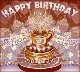
Finished the promotional sign for the inside the shop. I feel like it's a little more complete this way.

 completed illustration.
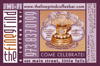
 in context - postcard.
Irony saves the day...
It's been weeks since I've been able to get my act together enough to post something, let only a new something, especially a new something more complete than a rough sketch! Now at last I can post a finished illustration - thanks to the luck of the draw - no pun intended.
I do design work for a friend of mine with a coffee shop on a regular basis. This coming month is the shop's first anniversary, so the two of us came up with a birthday cake theme. The illustration will be used in several ways (Signs, Ads, promotional flyers, etc.) but the first thing she needed was a postcard to promote the celebration itself. Do you like?
What gets me is that I spent a good part of Friday evening completing this design - before I even looked at the IF theme this week. Too funny!!
I'll post the rest as I finish it. And if you like in the northern New Jersey area - don't forget to stop by!!

7 comments:
Great work!!
MD
It's good to see something from you! Yes - I like this very much! The colors have that rich coffee shop look. The coffee tones go so well with the purples. It looks great!
Very pleasing illustration. Already looks like a beautiful stamp.
Love the colors! I never thought lilac and brown could go so well together!
Very cool. Love the colors and illustration.
explosive joy! i can almost smell thick chocolate in the coffee.
how's it going? are you taking any courses this summer? i maybe taking a few.
best
w
welcome back… i know how overwhelming being a designer can be… your illustration and design work are wonderful…if it weren't so late I might go get some coffee…
Post a Comment